The visual history of blue
Blue is the one colour humans had to manufacture. It barely exists in usable minerals, so for 4,500 years the history of blue in art is really a history of chemistry, trade routes and cost — and of what a civilisation was willing to pay to see it.
Most pigments were dug out of the ground cheaply: ochres, umbers, chalk, charcoal. Blue was different. There is almost no stable blue mineral available in quantity, which meant blue had to be synthesised or imported at ruinous expense. That single chemical accident shaped where blue appears in art for millennia — reserved for gods, for the Virgin, for the very rich — and it explains why the moment blue became cheap is also the moment painting changed. Follow five works and you are really following a supply chain.
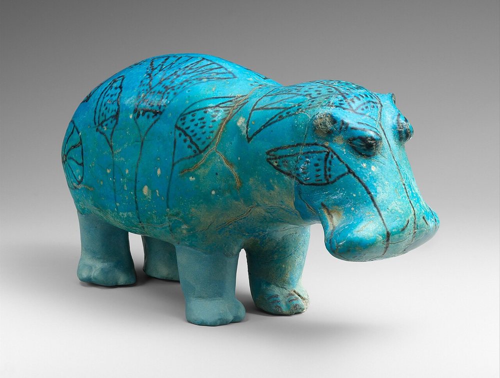
Made in Egypt's Middle Kingdom, c. 1961–1878 BCE, this small faience hippopotamus is glazed in what is generally regarded as the first synthetic pigment humans ever made — Egyptian blue, produced by firing sand, lime and a copper source at high temperature. It is a genuinely remarkable thing: several thousand years before industrial chemistry, a workshop worked out how to manufacture a colour that nature would not supply. The technique was later lost for centuries.
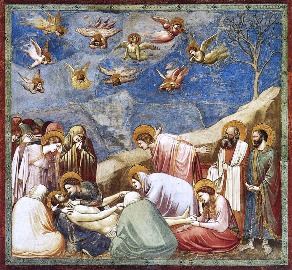
The sky of the Scrovegni Chapel is one enormous field of ultramarine — lazurite ground from lapis lazuli, carried overland from mines in what is now Afghanistan. In the fourteenth century the prepared pigment cost more than gold by weight, and contracts routinely specified how much of it a patron was buying. Giotto spending it on empty sky rather than on a robe is a statement about money as much as about heaven.
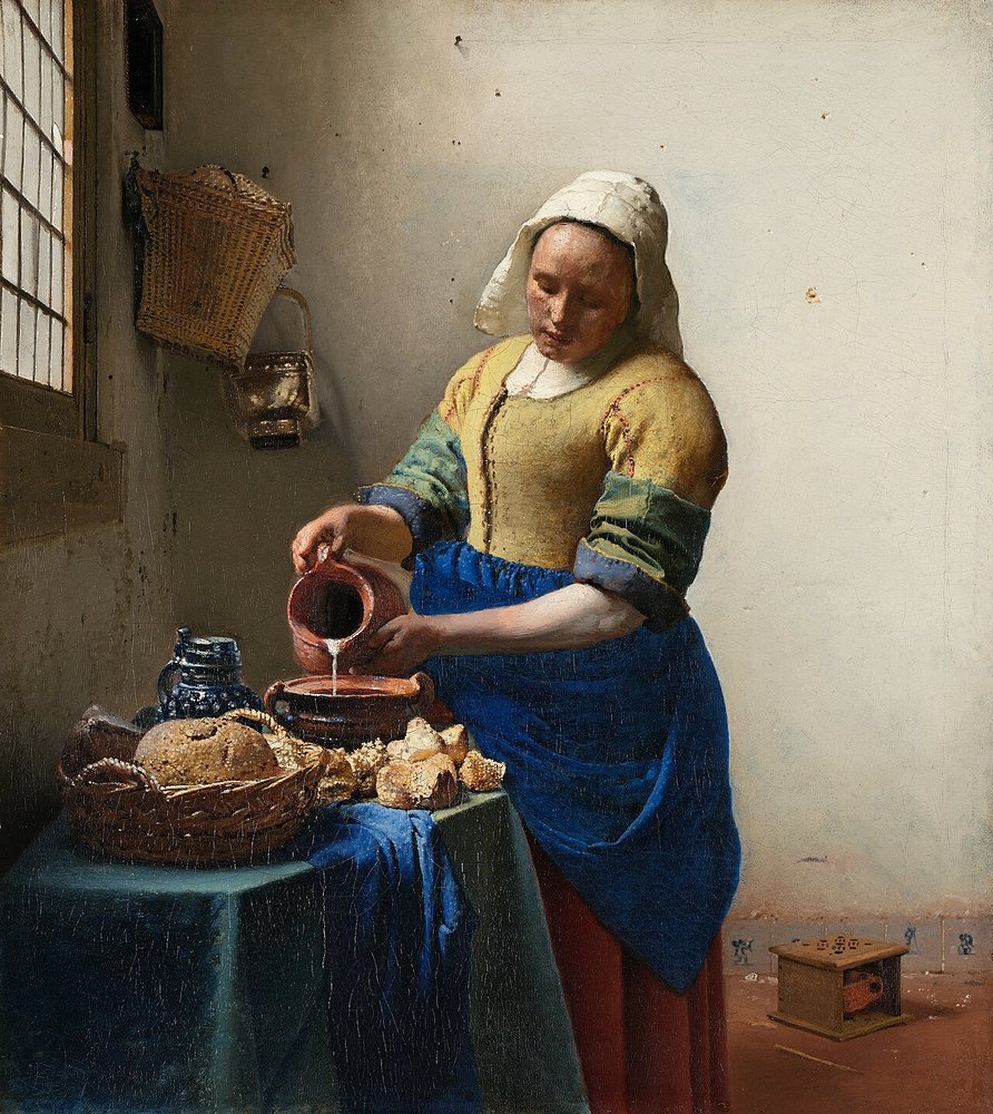
Vermeer put natural ultramarine — still the most expensive material available to him — on a kitchen servant's apron. Not a Madonna, not a donor portrait: a woman pouring milk. Analysis of his blues for the Girl in the Spotlight project found a high-quality grade of lazurite, and suggested the stone was heat-treated before grinding to yield a more intense colour. The extravagance is the argument: ordinary life was worth the costliest thing in the studio.

The blue here is Prussian blue, an accident from a Berlin laboratory around 1704–06 that reached Japan through Dutch traders at Nagasaki. It was far too costly for print runs until Chinese production made it affordable in the late 1820s — precisely when this series appeared. Known in Japanese as bero-ai, "Berlin indigo", it set off a vogue for blue prints. A European industrial accident became the most recognisable image in Japanese art.
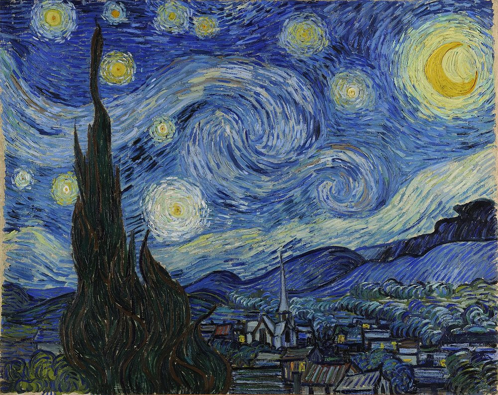
By 1889 blue was simply available. Synthetic ultramarine had been cracked in the 1820s and cobalt earlier still, so a painter with very little money could cover a canvas in a colour that had once been rationed by contract. Van Gogh used it the way you use something cheap: lavishly, in thick spirals, across the entire surface. The scarcity that had governed blue for four thousand years had ended within his grandparents' lifetime.
What four thousand years changed
The arc of blue is an argument about cost, not taste. When the colour had to be mined in Afghanistan and carried overland, it was reserved for the sacred and written into contracts by the ounce — blue meant this patron paid. When Vermeer put it on an apron, he was making a deliberately expensive claim about ordinary life. When a Berlin laboratory accident reached Japan, blue became a printmaker's working colour and produced the most reproduced image in Japanese art. And when nineteenth-century chemistry made it nearly free, van Gogh poured it over an entire sky. The lesson generalises well beyond pigment: what a culture treats as precious is often just what its supply chain has not yet solved. Scarcity does a great deal of the work we usually attribute to meaning — and when the scarcity ends, the meaning quietly moves somewhere else.
See these works in print
The definitive books on blue in art:
- Blue: The History of a Color — Michel Pastoureau
- Bright Earth: Art and the Invention of Color — Philip Ball
- Color: A Natural History of the Palette — Victoria Finlay
- The Secret Lives of Colour — Kassia St Clair
As an Amazon Associate, ReadGlobe earns from qualifying purchases — at no extra cost to you.
Related on ReadGlobe
Works are public domain or CC0, sourced from Wikimedia Commons and the Metropolitan Museum of Art Open Access, with artist, date and licence verified at source. Pigment history draws on published conservation research including the Girl in the Spotlight project (Mauritshuis) and MFA CAMEO. Editorial synthesis © ReadGlobe.